Pocketbook
Pocketbook is a budget planner and personal finance app owned by Zip Co. I collaborated with a small product engineering team on the app's redesign from Aug 2020 to mid 2021. This page showcases some of the flows and screens that I created for this application.
Sign up flow
The biggest challenge during onboarding was communicating a value proposition that resonated with users and making them feel secure about linking their bank accounts to the app. To achieve this, we tested various combinations of visuals and copy to help users understand and be intrigued by the app's capabilities. Additionally, we experimented with several methods to highlight the security of the bank linking process, aiming to improve click-through rates and overall onboarding success.
Explore tab
A budgeting app doesn’t change one’s spending habit and help achieve financial goals overnight. Therefore, it can be a challenge to deliver value on day one and have user engaged in long term. To address this problem, I reimagine how users engage with the app on a regular basis with the explore tab.
The Explore tab is essentially a feed of the latest insights about users' income and spending presented in small, digestible widgets. These insights are ready as soon as bank accounts are connected. Users can understand their financial habits at a glance and identify improvement opportunities. This approach eliminates the need for users to dive into the nitty-gritty of data and charts. It has been tested and proven to be a more effective way to deliver value earlier in the journey and keep users engaged.
Track tab
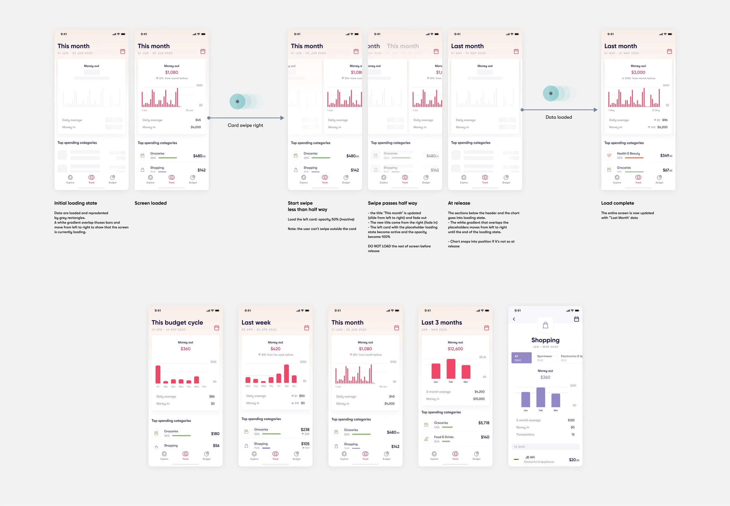
The track tab has been present in Pocketbook since its initial launch. The redesign aims to declutter data visualisation and make it more intuitive and versatile in catering to various time frames. Additionally, it aims to improve the information hierarchy and provide better navigation and visual distinction between the main budget and category budgets.
Budget tab
We have discovered that although many customers budget based on a calendar month, it is easier to plan and stay on track if they align their budget cycle with their pay cycle. Therefore, we introduced the ability to do so with the redesign.
To effectively communicate whether the user has kept their budget, we made many iterations on the main chart and stress tested it against different scenarios. In hindsight, we could have exercised more restraint when integrating the bills component, making it easier to understand and present more cohesively with the rest of the elements.


